
Guide
Scrub colours: what each shade means and how to choose yours
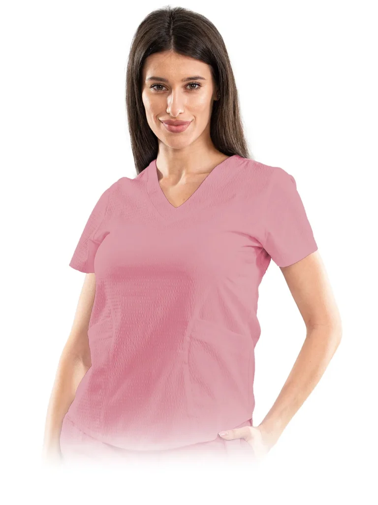
The colour of your scrubs speaks before you do. A patient walking through the door knows nothing yet about the training or experience of the person greeting them, but their eye instantly registers the white, blue or burgundy top and forms a first impression: this place is orderly, this place is calm, I am in good hands. Choosing a colour is not a matter of taste alone; it is a small act of communication you wear on yourself every shift.
The good part is that with us the choice is anything but theoretical. In our factory we make medical scrubs in 24 colours held in stock: 18 on the PI fabric, the stretchy weave we use for most of our models, and 6 on the Gofra fabric. There is plenty to choose from, whether you work in a hospital with a strict dress code or in a salon where the uniform is part of the atmosphere.
This guide helps you choose with purpose: we cover what each colour family conveys, how to pick a colour for your workplace, how colour becomes a team’s identifying mark, and how to keep it vivid through many washes.
Why colour matters in a medical setting
The colour of a uniform shapes how patients perceive you before the first word is exchanged, and in healthcare that first impression often forms in a moment of vulnerability. The person in front of you is tired, worried, or simply afraid of what comes next. Everything they see, from the light in the room to the clothes the staff wear, either confirms their unease or softens it.
You do not need studies to notice the effect: a room in quiet tones feels different from a loud one, and a team dressed neatly and coherently inspires more confidence than a mismatched one. Calm colours help a patient relax, dark tones add weight and seriousness, warm ones bring people closer. These are common-sense observations, confirmed by anyone who works with the public day in, day out.
On top of the perception layer sits a practical one, just as important: the colour has to survive the shift. On white, every splash shows; on dark tones, almost nothing does. A colour that looks immaculate at 7 in the morning must still look respectable at the end of a 12-hour shift. A good choice balances both: what the colour conveys and how much it forgives.
What the common scrub colours mean
Each colour family conveys something different, and the associations below prove themselves daily in hospitals, clinics, practices and salons. We take them in turn, from classic white to the dark tones that have grown so popular in recent years.
White: classic authority
White remains the signature colour of the medical profession: cleanliness, rigour, professional authority. A white uniform states unambiguously that this is a clean, serious place of work. It is the safe choice wherever tradition matters, from family practices to laboratories.
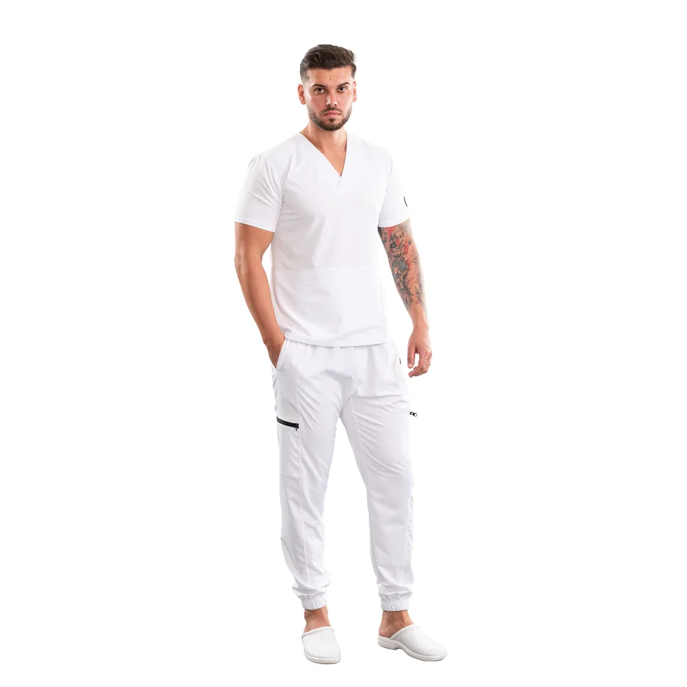
It has a flip side, though. White is merciless with stains and shows its age faster than any other colour. And with young or anxious patients, an all-white outfit can chill the atmosphere: many children have come to associate white clothing with the needle that follows. That is precisely why many paediatric practices deliberately choose something else.
Blue: professional calm
Blue is probably the most worn scrub colour in the world, and deservedly so: it soothes without creating distance and conveys competence without coldness. From light, almost pastel shades to deep navy tones, the whole family works in nearly any context, from the front desk to the treatment room. If you have no constraints and no clear preference, blue is the safest starting point.
Green: easy on the eye
Green carries the historic association with the operating theatre, which still lends it an air of surgical professionalism today. It is a restful colour, easy to look at for hours on end, one of the reasons it found its way into operating rooms in the first place. Muted shades say “a calm team that knows its trade”, while brighter ones bring freshness to practices with a more relaxed tone.
Warm tones: pink and peach
Warm tones, from powder pink to peach, convey gentleness and approachability. They are a frequent choice in paediatrics, in dental practices that treat children, and in beauty salons, cosmetics studios, wellness centres and spas, where the uniform should say “relaxation” rather than “procedure”. Paired with trousers in a neutral tone, they make a warm, well-groomed outfit that never tips into frivolous.
Dark tones: grey, black, burgundy
Dark tones have climbed visibly in popularity in recent years, especially in private clinics: they convey understated elegance and something close to business attire. Black and anthracite grey give a team a modern, almost technical look; burgundy adds personality without turning loud. And on the practical side they are the champions of forgiveness: small splashes and the traces of a long shift stay nearly invisible.
How to choose a colour for your context
The rule that comes before any personal preference: check the internal dress code of the place where you work. Many institutions have one, written or unwritten, and some reserve certain colours for certain roles or wards. A short message to your employer before ordering spares you a beautiful uniform you are not allowed to wear.
In hospitals, your room for choice is usually smallest: where colours are assigned by ward or by role, they are part of the daily organisation and not up for negotiation. In private clinics you often have more freedom, but even there the uniform tends to follow the clinic’s visual identity; if the reception, the website and the walls speak the same colour language, the scrubs are chosen to match.
In salons, cosmetics studios and spas, the uniform is part of the client’s experience, so warm tones or elegant dark ones are the natural choice. In veterinary practices and laboratories, practicality comes first: colours that visually withstand a busy day. We cover outfit choices by specialty at length in our guide to scrubs by medical specialty.
Colour as team identity
A team dressed in the same colour is recognisable at a glance, and the effects are entirely concrete: patients know who to look for, and the team gains cohesion and a professional air that mismatched clothing simply cannot deliver. In larger institutions, different colours per ward or per role make orientation easier for everyone, from patients to new colleagues.
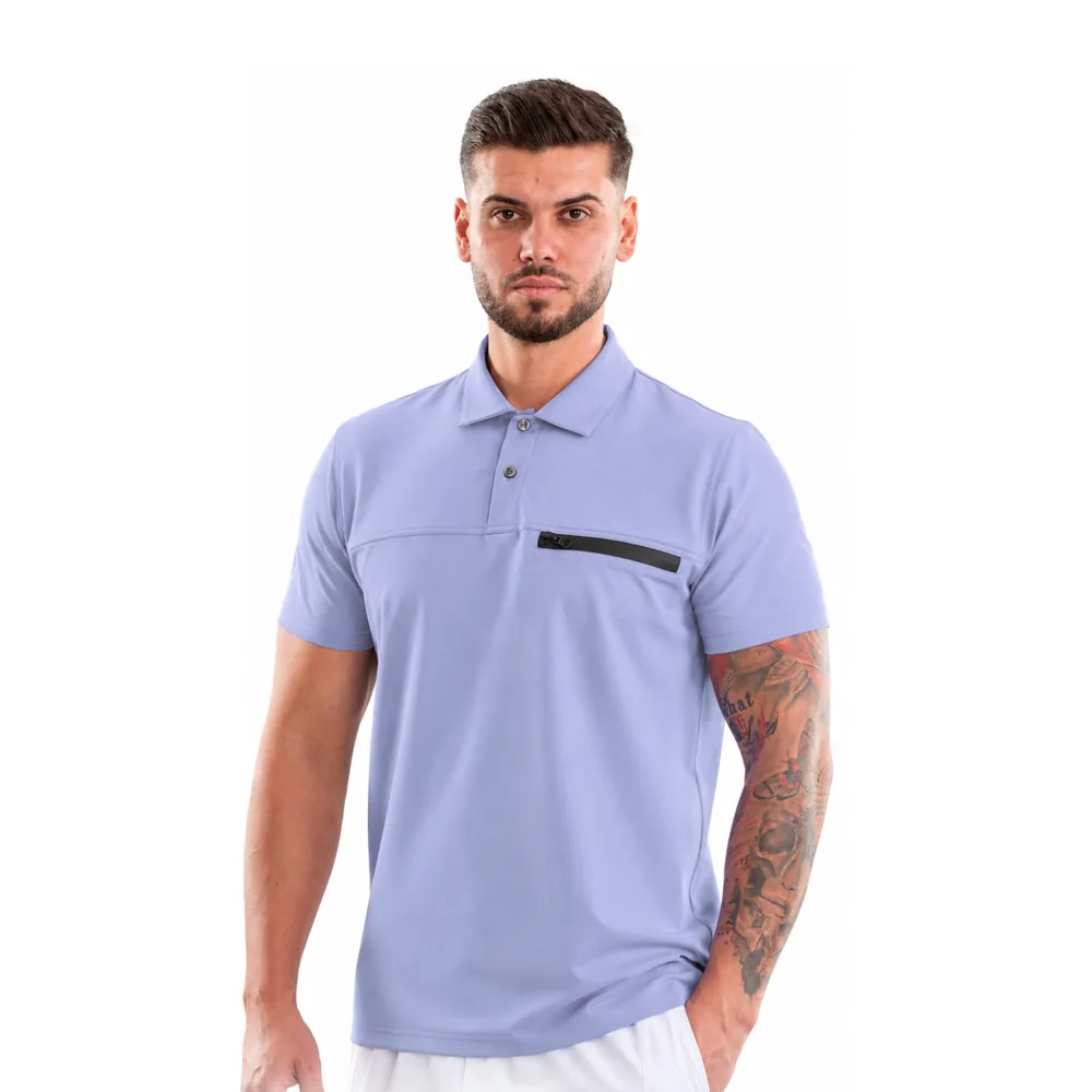
The next step after a unified colour is personalisation: the clinic’s or salon’s logo applied to the chest, through embroidery, screen printing, heat transfer or DTF printing, turns the uniform into a business card you wear. How to pick the right technique and how a team project unfolds is covered in our guide to personalised scrubs for teams.
If you are outfitting a whole team, in a single colour or on a colour scheme by role, the quote request on our business orders page is the shortest route: tell us how many people you have and which colours you want, and we come back with a concrete proposal from our stock of 24 colours.
In practice: how colour looks in real life versus on screen
A colour on a screen is always an approximation: every phone and every monitor displays the same shade slightly differently, depending on settings, brightness and age. The shade you see on the metro, on your phone with the brightness at half, is not exactly the shade of the fabric that arrives in your parcel.
That is why we recommend judging colour by the photographs on the product page: they are taken on the real fabric, not on digital swatches, and show how the shade sits on the weave, with its natural texture and sheen. Look at them on as large a screen as you can, at normal brightness, and compare the colours you are drawn to side by side.
Keep one more detail in mind, one few people consider: the light you will wear the uniform in. The cold fluorescent light of a practice brings out a blue differently from the warm light of a salon. If the overall look matters a great deal, as it does in image-conscious clinics, order a single piece in your chosen colour first, look at it in your own space, and then complete your wardrobe, both from our women’s collection and from the men’s collection.
Colour care: how it stays vivid wash after wash
Scrubs made from our PI fabric withstand over 100 industrial washes without fading, so the colour you choose today will still be the same after a year of intensive wear. The synthetic weave, 92% polyester and 8% elastane, holds pigment differently from cotton: it does not wash out shift after shift and never takes on the tired look of old uniforms.
The condition is to follow a few simple rules: wash at 30-40°C on a synthetics cycle, never use chlorine bleach, the enemy of every colour, and dry naturally on a hanger or in a dryer on low heat. Ironing is not even necessary, and if you insist, only on the lowest setting and inside out. All the details, including how to deal with stubborn stains, are in our guide to washing medical scrubs.
One good habit, especially at the start: wash coloured scrubs separately from white laundry and turned inside out. Not because our shades would run, but because it is the basic hygiene of any working wardrobe, and it keeps the face of the fabric away from direct friction with other garments.
Frequently asked questions
Which colour should I choose if my employer has no rules?
Start from your working context and from what you want to convey: blue and green are safe choices almost anywhere, warm tones suit places where approachability matters, and dark ones look elegant and forgive stains the most. If you still cannot decide, pick blue: it is the colour that never misses in any medical environment.
Do the colours fade with repeated washing?
No, as long as you follow the care instructions. The PI fabric withstands over 100 industrial washes without losing its colour, with one firm condition: no chlorine bleach. Wash at 30-40°C on a synthetics cycle and dry naturally, and the shade stays the one you saw on day one.
Can I wear the top and the trousers in different colours?
Yes, and the combination looks very good when it is thought through: a top in a warm or vivid tone with trousers in a neutral one, or two shades from the same colour family. The pieces are sold separately precisely so you can combine colours and sizes freely. Just check that your internal dress code allows combinations.
How do I choose between 24 colours without seeing the fabric in person?
Judge by the photographs on the product pages, taken on the real fabric, and compare the shades side by side on a good screen. On your first order, buy a single piece in the colour you want, look at it in the light you work in, and then complete the rest of your wardrobe in the confirmed shade.